26.9.2023 - 24.10.2023 (Week 1 - Week 5)
Tan Sin Mi (0368821)
Typography
Task 1
CONTENT
- LECTURES
- INSTRUCTIONS
- FEEDBACK
- REFELECTIONS
- FURTHER READING
LECTURES
CLASS SUMMARY
WEEK 1:
In the first class, Ms. Low and Mr. Vinod explained what typography is and
let us watch the tutorial, it teaches us how to setup our E-portfolio. Follow
the step of the tutorial, we created a blogger and we're going to put our
task on it. Before the class end, we were given 6 words to choose 4 words
from it and sketch, we will have to put our design on our E-portfolio.
WEEK 2:
For today, we have shown our sketch to our lecturer, and we have to write
down the feedback from lecturer for the sketch. Then, we are using Adobe
Illustrator to create our digitized explorations.
WEEK 3:
This week, we're ending our exercise 1 of task 1 and start the exercise 2. Mr. Vinod has provided the text formatting video tutorials for us to watch before attempting the task.
We have to upload the lecture summary of "Typo_2_Basic". Done the text formatting exercise and upload the final exercise 2 to our E-portfolio.
We have to complete the E-portfolio of task 1 and start the task 2 exercise. The due date for Task 1 was 3rd November 11.59pm.
LECTURES SUMMARY
1. INTRODUCTION
TERMINOLOGY
I. Font
-
A font refers to the individual font or weight within
the typeface.

|
Figure 1.1 Example of Georgia fonts
|
II. Typeface
-
A typeface refers to the entire family of fonts/weights that share
similar characteristics/styles.

|
|
Figure 1.2 Example of Typeface
|
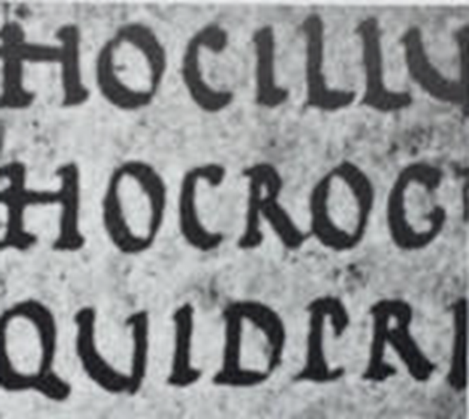
2. DEVELOPMENT / TIMELINE
1) EARLY LETTERFORM DEVELOPMENT: PHOENICIAN TO ROMAN

|
Figure 2.1 Augustan inscription in the Roman Forum, Rome
|
I. Phoenician
-
Writing meant scratching into wet clay with sharpened stick or carving
into stone with a chisel.
-
Uppercase forms can be seen to have evolved out of these tools and
materials.
-
Uppercase forms are essentially combinations of straight lines and
pieces of circles.
Figure 2.1.1 Phoenicians votive stele Carthage, Tunisia
Figure 2.1.2 Evolution from
Phoenician letter
II. Greeks
-
The lines of text read alternately from right to left and left to right,
this style of writing called ‘boustrophedon’ (how the ox ploughs).
-
As they change the direction of reading, they also changed the orientation
of the letterforms.

|
|
Figure 2.1.3 The Greeks writing style
"Boustrophedon"
|

|
|
Figure 2.1.4 Greek fragment, stone engraving (Date
unknown)
|
III. Etruscan
-
Carvers working in marble painted letterforms before inscribing them.
-
Certain qualities of their strokes carried over into the carved
letterforms - a change in weight from vertical to horizontal, a broadening
of the stroke at start and finish.

|
Figure 2.1.5 Augustan inscription in the Roman Forum, Rome
|
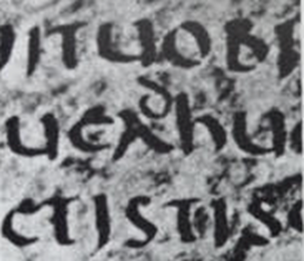
2) HAND SCRIPT FROM 3rd-10th CENTURY C.E.
I. Square Capitals
- Added serifs to the finish of the main strokes.
-
The variety of stroke width was achieved by the reed pen held at an
angle of approximately 60° off the perpendicular.

|
|
Figure 2.2.1 Square Capitals (4th or 5th century)
|
II. Rustic Capitals
-
Allowed for twice as many words on a sheet of parchment and took far
less time to write, is a compressed version of square capitals.
-
The pen or brush was held at an angle of approximately 30° off the
perpendicular.
-
It's faster and easier to, but slightly harder to read due to their
compressed nature.
|
|
Figure 2.2.2 Rustic Capitals (Late 3rd – mid 4th century)
|
III. Roman Cursive
-
Everyday transactions were typically written in cursive hand in
which forms were simplified for speed.
- Beginning with lowercase letterforms.
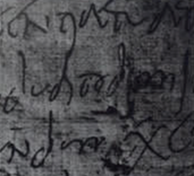
|
|
Figure 2.2.3 Roman Cursive (4th century)
|
IV. Uncials
-
Incorporated some aspects of the Roman cursive hand,
especially in the shape of the A, D, E, H, M, U and Q
-
Think of uncials simply as small letters and it be
more readable at than rustic capitals.
|
|
Figure 2.2.4 Uncials (4th – 5th century)
|
V. Half-Uncials
-
A further formalization of the cursive hand.
-
It marks the formal beginning of lowercase
letterforms.

|
|
Figure 2.2.5 Half-Uncials (C.
500)
|
VI. Charlemagne
-
The first unifier of Europe since the Romans, he
issued an edict to standardize all
ecclesiastical texts.
-
The monks rewrote the texts using both
majuscules (uppercase), miniscule,
capitalization and punctuation.
-
Set the standard for calligraphy for a century.

|
Figure 2.2.6 Caloline
Miniscule (C. 925)
|
3) BLACKLETTER TO GUTENBERG's TYPE
I. Blackletter
-
With the dissolution of Charlemagne’s empire
came regional variations upon Alcuin’s
script.
~ Northern Europe: A condense strongly vertical
letterform know as Blackletter or textura
gained popularity.
~ South Europe: A rounder more open hand gained
popularity, called ‘rotunda’.

|
|
Figure 2.3.1 Blackletter
(Textura) (C. 1300)
|
II.
Gutenberg's
-
Gutenberg’s skills
included
engineering,
metalsmithing, and
chemistry.
-
He marshaled them
all to build pages
that accurately
mimicked the work of
the scribe’s hand.
-
His type of mold
required a different
brass matrix, or
negative impression,
for each
letterform.

|
|
Figure
2.3.2
42-line
bible,
Johann
Gutenberg,
Mainz
(C.
1455)
|
4) TEXT
TYPE
CLASSIFICATION
I.1450_Blackletter

Figure
2.4.1
|
|
-Used
for
books
in
Northern
Europe
-e.g.
Cloister
Black
&
Cloudy
Text
|
II.1475_Oldstyle
Figure
2.4.2
|
-Used
by
Italian
humanist
scholar
for
book
copying
-e.g.
Bembo,
Casion,
Dante,
Janson,
Jenson,
Palatino
&
Garamond
|
III.1500_Italic

Figure
2.4.3
|
-Echoing
contemporary
Italian
handwriting.
-Condensed
and
close-set.
|
IV.1550_Script

Figure
2.4.4
|
-Origin
from
engraved
calligraphy
forms
-e.g.
Kuenstler
Script
&
Mistral
&
Snell
Roundhand
|
V.1750_Transitional

Figure
2.4.5
|
-Refinement
of
oldstyle,
lighted
brackets
-e.g.
Baskerville,
Bulmer,
Century
&
Time
Roman
|
VI.1775_Modern

Figure
2.4.6
|
-Serifs
unbracketed
and
contrast
between
stroke
extreme
-e.g.
Bell,
Bodoni,
Didot
&
Walbaum
|
VII.1825_Square
Serif / Slab
Serif

Figure
2.4.7
|
-Bracket
were
dropped
-e.g.
Clarendon,
Memphis,
Rockwell
&
Serifa
|
VIII.1900_Sans
Serif

Figure
2.4.8
|
-Typefaces
eliminated
serifs
altogether
-e.g.
Akzidenz
Grotesk,
Gill
Sans,
Franklin
Gothic,
Frutiger,
Futura,
Helvetica,
Meta,
News
Gothic,
Optima
|
IX.1990_Serif
/ Sans
Serif

Figure
2.4.9
|
-The
most
recent
development
-e.g.
Rotis,
Scala,
Stone
|
3.
BASIC
1)
DESCRIBING
LETTERFORMS
"Knowing
a
letterform’s
component
parts
make it
much
easier
to
identify
specific
typefaces."
-
Baseline:
Imaginary
line the
visual
base of
the
letterforms.
-
Median:
Imaginary
line
defining
the
x-height
of
letterforms.
-
X-height:
Height
in any
typeface
of the
lowercase
'x'.
-
Stroke: Any
line
that
defines
the
basic
letterforms.
-
Apex /
Vertex: The
point
created by
joining
two
diagonal
stems
(apex for
above and
vertex for
below).
-
Arm: Short
strokes
off the
stem of
the
letterform,
either
horizontal
or upward.
-
Ascender: Stroke
that
exceed the
median
line.
-
Barb: Half
finish on
some
horizontal
arms.
-
Beak: Half-serif
finish
on
some
horizontal
arms.
-
9Bowl:
Rounded
form
describes
a
counter,
may be
open or
closed.
-
Bracket: Base of
the
letterform.
-
Cross
Bar: Connect
two stem
stroke.
-
Cross
Stroke: Stroke
that joins
two stems
together
(found in
lowercase
letter f
and t).
-
Crotch:
Interior
space
where two
strokes
meet.
-
Descender:
Anything
below
baseline.
-
Ear: Stroke
extending
out from
the main
stem.
-
Em:
Distance
equal to
the size
of the
typeface.
-
En: Half of
the em.
-
Finial: Rounded
non-serif
terminal
to a
stroke.
-
Leg: Short
stroke off
the stem
of the
letterform.
-
Ligature:
Character
formed by
the
combination
of two or
more
letterform.
-
Link: Stroke
that
connects
the bowl
and loop
of a
lowercase
letter
'g'.
-
Loop: Bowl
created in
the
descender
lowercase
letter
'g'.
-
Serif: Right-angled
foot at
the end of
the
stroke.
-
Shoulder: Curve
stroke
that is
not part
of a bowl.
-
Spine: Curve
stem
of the
letter
'S'.
-
Spur: Extension
the
articulates
the
junction
of the
curved
and
rectilinear
stroke.
-
Stem:
Significant
vertical
or oblique
stroke.
-
Stress:
Orientation
of the
letterform,
indicated
by the
thin
stroke in
round
forms.
-
Swash:
Flourish
that
extends
the stroke
of the
letterform.
-
Tail: Curved
diagonal
stroke at
the finish
of certain
letterform.
-
Terminal:
Self-contained
finish of
a stroke
without a
serif.
"To work successfully with type, you should make sure that you are working with a full font and you
should know how to use it."
-
Uppercase: Capital
letters,
e.g. A, B,
C, D,E,
etc.
-
Lowercase:
Lowercase
letters,
e.g. a, b,
c, d, e,
etc.
-
Small
Capitals:
Uppercase
letterforms
draw to
the
x-height
of the
typeface.

|
|
Figure
3.2.1
Example
of
Small
capitals
|
|
|
-
9Uppercase
Numerals:
Lining
figures,
these
numerals
are
the
same
height
as
uppercase
letters
and
are
all
set
to
the
same
kerning width.
-
Lowercase
Numerals:
Old
style
figures
/
Text
figures,
these
numerals
are
set
to
x-height
with
ascenders
and
descenders.
-
Italic
VS
Roman

|
Figure
3.2.2
Italic
VS
Roman
fonts
|
-
Punctuation,
Miscellaneous
Character: Although
all
fonts
contain
standard
punctuation
marks,
miscellaneous
characters
can
change
from
typeface
to
typeface.

|
Figure
3.2.3
Example
of
punctuation
miscellaneous
character
|
|
-
Ornaments:
Used
as
flourishes
in
invitations
or
certificates.
Usually
are
provided
as a
font
in a
larger
typeface
family.

|
|
Figure
3.2.4
Example
of
Ornaments
|
3)
DESCRIBING
TYPEFACES
"Once
you
can
recognize
the
parts
of
a
letterform,
you
can
apply
what
you
know
to
identify
different
typefaces.
"
-
Roman:
It
is
so
called
because
the
uppercase
forms
are
derived
from
inscriptions
of
Roman
monuments.
-
Italic: Named
for
fifteenth
century
Italian
handwriting
on
which
the
forms
are
based.
-
Boldface: Characterized
by a
thicker
stroke
than
a
roman
form.
-
Light: A
lighter
stroke
than
the
roman
form.
-
Condense: A
version
of
the
roman
form,
and
extremely
condense
styles
are
often
called
‘compressed’.
-
Extended:
An
extended
variation
of a
roman
font.

|
|
Figure
3.3
Describing
Typefaces
|
4)
COMPARING
TYPEFACES
"Easy
readability
and
an
appropriate
expression
of
contemporary
esthetics."

|
|
Figure
3.4
Example
of
different
typefaces
|
4.
TEXT_PART_1
1)
TRACKING:
KERNING AND
LETTERSPACING
-
The automatic
adjustment of
space between
letters.
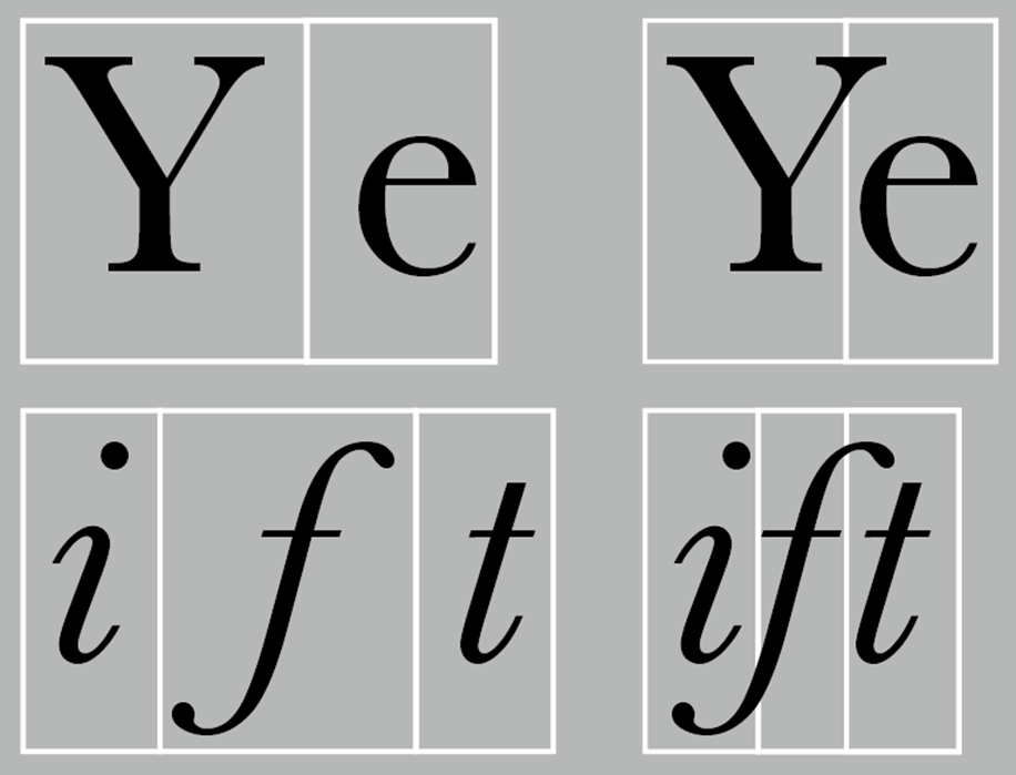
|
Figure
4.1.1
Example
of
Kerning (with/without)
|
II. Tracking
-
The
addition
and
removal of
space in a
word or
sentence

|
Figure
4.1.2
Example
of
Tracking
(normal/tight/loose)
|
III.
Letterspacing
-
add space
between
the
letters.

|
Figure
4.1.2
Example
of
Letterspacing
|
I. Flush Left
-
Each line starts at the same point but ends wherever the last
word on the line ends.
|
Figure 4.2.1 Example of Flush Left
|
|
II. Centered
-
This format imposes symmetry upon the text, assigning equal
value and weight to both ends of any line.
|
Figure 4.2.2 Example of Centered
|
|
III. Flush Right
-
This format places emphasis on the end of a line as
opposed to its start.

|
Figure 4.2.3 Example of Flush
Right
|
|
IV. Justified
-
Like centering, this format imposes a symmetrical
shape on the text.

|
Figure 4.2.3 Example of
Justified
|
|
-
Different typefaces suit different messages.
-
Need to consider the different textures of these
typefaces too.

|
Figure 4.3 Some different textures
example
|
4)
LEADING
AND
LINE
LENGTH
I.
Type
Size
-
Text
type
should
be
large
enough
to
be
read
easily
at
arm's
length.
II.
Leading
-
Text
should
not
set
too
tightly
or
loosely,
so
that
reader
will
easier
and
comfort
to
read
the
material.
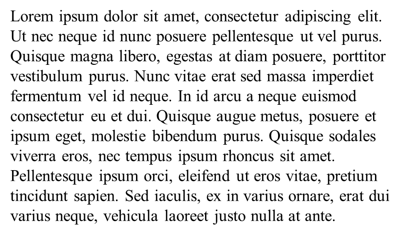
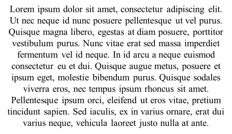
III.
Line
Length
-
Keep
line
length
between
55-65
characters
is
better,
extremely
long
or
short
lines
lengths
impairs
reading.

|
Figure 4.4 Example of Leading and Line
Length
|
5) TYPE SPECIMEN BOOK
-
Provide an accurate reference for type,
type size, type leading, type line
length etc.

|
Figure 4.5 Sample Type Specimen
Sheet
|
5. TEXT_PART_2
1) INDICATING PARAGRAPHS
I. Pilcrow (¶)
- A holdover from medieval manuscripts seldom uses today.
 |
Figure 5.1.1 Sample of Pilcrow
|
|
II. LINE SPACE
- Hence if the line space is 12pt, then the paragraph space is 12pt.
- This ensures cross-alignment across columns of text.
 |
Figure 5.1.2 Sample of line space
|
|
III. STANDARD INDENTATION
- The indent is the same size of the line spacing or the same as the point size of your text.
 |
Figure 5.1.3 Standard indentation
|
|
IV. UNUSUALLY WIDE COLUMNS OF TEXT
- Despite these problems, there can be strong compositional or functional reasons for choosing it.
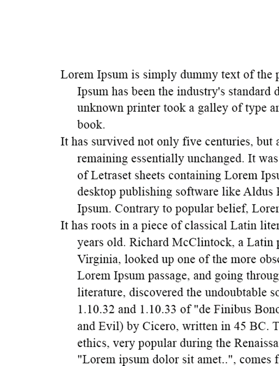 |
Figure 5.1.4 Unusually wide columns of text
|
|
I. Window- A short line of type left alone at the end of a column of text.
II. Orphan- A short line of type left alone at the start of new column.
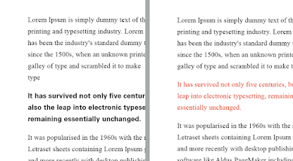
3) HIGHLIGHTING TEXT
- Different kinds of emphasis require different kinds of contrast
 |
| Figure 5.3.1 different kinds of contrast 1 |
.png) |
| Figure 5.3.2 different kinds of contrast 2 |
|
- The sans serif font (Univers) has been reduced by 0.5 to match the x-height of the serif typeface of 8.
 |
| Figure 5.3.3 the sans serif font has been reduced |
|
- Aligned figures (numbers) or All Capital acronyms embedded in text by 05 as well, to ensure visual cohesion of the text.
 |
| Figure 5.3.4 aligned figures/all capital acronyms embedded in text |
|
- When highlighting text by placing color at the back of the text, maintaining the left reading axis (right example) of the text ensures readability is as its best.
 |
Figure 5.3.5 maintaining left reading axis of the text
|
- Placing certain typographic elements outside the left margin of a column of type ( extending as opposed to indenting) to maintain a strong reading axis.
 |
Figure 5.3.6 placing certain typography elements outside the left margin
|
- Quotation marks, like bullets, can create a clear indent, breaking the left reading axis. Compare the intended quote at the top with the extended quote at the bottom.
 |
| Figure 5.3.7 Example of quotation marks |
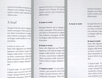
4) Headline within text
- Indicates a clear break between the topics within a section.
 |
| Figure 5.4.1 Example of A head |
|
II. B head- B head is subordinate to A head. B head indicate a new supporting arguments or examples for the topic at hand.
 |
| Figure 5.4.2 Example of B head |
|
III. C head- C head highlight specific facets of material within B head text, not materially interrupt the flow of reading
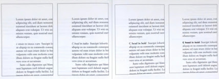 |
| Figure 5.4.3 Example of C head |
|
- Putting together a sequence of subheads.
- No single way to express hierarchy within text; in fact the possibilities are virtually limitless.
.png) |
| Figure 5.4.4 Example of putting together a sequence of subheads |
5) CROSS ALIGNMENT
- Cross aligning headlines and captions with text type reinforces the architectural sense of the page.
.png) |
| Figure 5.5.1 four lines of caption type (leaded 9 pts.) cross-align with three lines of text type (leaded to 13.5pts) |
.png) |
| Figure 5.5.2 one line of headline type cross-aligns with two lines of text type, and four lines of headline type cross-align with five lines of text type |
|
INSTRUCTIONS
Task 1: Exercises 1 - Type Expression
WEEK 1:
I. SKETCHES
We were given 6 words to choose 4 words from it and design it.
These are the 6 words:
CHAOS ; SPRING ; DIVE ; BOUNCE ; FLOAT ; CRUSH
And I chose Chaos, Crush, Bounce, Dive.
1. CHAOS

|
|
Figure T.1.1 Exercises- CHAOS (sketch)
|
2. CRUSH

|
|
Figure T.1.2 Exercises- CRUSH (sketch)
|
|
3. BOUNCE

|
|
Figure T.1.3 Exercises- BOUNCE (sketch)
|
|
4.DIVE

|
|
Figure T.1.4 Exercises- DIVE (sketch)
|
|
WEEK 2:
II. DIGITIZATION
Using Adobe Illustrator to digitize our
sketch.
 |
| Figure T.1.5 Final of the static type expression exercise (JPEG/4 words) |
|
| Figure T.1.6 Final of the static type expression exercise (PDF/4 words) |
WEEK 3:
III. ANIMATIONAnimate one type expression.
| Figure T.1.7 Progress of creating animation (bounce) |
.gif) |
| Figure T.1.8 Final of the animation type expression exercise (bounce) |
|
Task 1: Exercises 2 - Type Formatting
WEEK 4:
We are going to use Adobe InDesign to learn kerning and tracking.
First, we are required to do the first exercise with our name and using the 10 typefaces provided only.
MY FINAL OF MY NAME WITH KERNING AND TRACKING:
 |
| Figure T.1.9 Final of my name with kerning and tracking |
|
WEEK 5:
We are going to use the content that provided by Mr. Vinod and add a picture with caption to do the last exercise of task 1.
MY FINAL TEXT FORMATTING TASK:
HEAD
Font/s: ITC New Baskerville Std Bold Italic
Type Size/s: 61pt
Leading: 73pt
Paragraph spacing: -
BODY
Font/s: Bodoni Std Book Italic
Type Size/s: 12pt
Leading: 11pt
Paragraph spacing: 11pt
Characters per-line: Average at 45
Alignment: Flush left
Margins: 12.7mm top, 12.7mm left + 12.7mm right + 150mm bottom
Columns: 4
Gutter: 4.234mm
 |
Figure T.1.10 Final of text formatting task without grids (JPEG)
|
 |
Figure T.1.11 Final of text formatting task with grids (JPEG)
|
Figure T.1.12 Final of text formatting task without grids (PDF)
Figure T.1.12 Final of text formatting task with grids (PDF)
FEEDBACK
Week 1:
- General Feedback: We have to upload our task and lectures summary every week. Paste the label E-portfolio link to the Google Feedback Sheet.
- Specific Feedback: Follow the video that have given us and setup our E-portfolio. Use the 10 fonts that given by Ms. Hsin to sketch the 4 words.
Week 2:
- General Feedback: I have to upload my artwork, further reading and lecture summary.
- Specific Feedback: Because I haven't got the access of adobe, so I could just sketch out the words on a piece of paper first.
Week 3:
- General Feedback: I have to upload my further reading and reflections.
- Specific Feedback: For the sketch, Ms. Hsin given me some suggestion to choose my sketches. And I have to animate one type expression.
CHAOS: Choose the first sketch.
CRUSH: Choose the second or fourth sketch of it.
BOUNCE: Ms. Hsin suggested the second or fourth sketch, but the fourth one is better.
DIVE: Ms. Hsin suggest me to try the third sketch, but the other sketches are not okay.
Week 4:
- General Feedback: I have to upload my further reading and reflections. MIB not previewing.
- Specific Feedback: I have uploaded my final sketches and animation. Ms. Hsin and Mr. Vinod passed my final work of task 1.
- General Feedback: I have to upload my further reading and reflections. Task 1 must be done to submit before due date.
- Specific Feedback: I have uploaded my final exercise 2 of task 1. Task 2 exercise have uploaded by Mr. Vinod in TEAMs, I can start to do my task 2 exercise.
REFELECTIONS
Experience
I learned a lot about typography and before that I had never had a deep understanding of typography and using adobe apps. Under the guidance of Ms. Hsin and Mr. Vinod, I learned how to use Adobe to digitize and improve my designs. The lecturers will arrange exercises every week and give us timely feedback and explanations.
Observations
After learning about font design and typesetting, I found that these things are one of the things that often appear in daily life, such as the typesetting of newspapers and advertisements, the design of packaging, etc. A perfect layout can make it more comfortable for the public to watch and use.
Findings
Our lives are surrounded by typography. A perfect typography requires a lot of time and effort to create. After trying to design my own, I started looking around and looking at many different designs online to expand my ideas.
FURTHER READING
We are required to do further reading for typography. From the book list that given by Mr. Vinod, I chosen this book, "The Vignelli Canon" written by Massimo Vignelli.
This book is nice for young designers who was lack of basic typographic. Massimo Vignelli have shared his professional knowledge that might be useful in this book.
In this book, Massimo Vignelli presents his concepts and methods of design in two parts: The Intangibles and The Tangibles.
PART 1: THE INTANGIBLES
Semantics
Massimo Vignelli stresses that semantics in design involve creating something with a clear and meaningful purpose that communicates effectively to both the sender and the receiver.
- Semantics is the search of the meaning of whatever we have to design.
- An essential part of the designer’s being, a crucial component of the natural process of design, and the obvious point of departure for designing.
- Semantics indicate the most appropriate form for that particular subject that we can interpret or transform according to our intentions.
Syntactics
Massimo Vignelli emphasizes the significance of syntactics as a fundamental aspect of design that contributes to the overall effectiveness of visual communication.
- The discipline that controls the proper use of grammar in the construction of phrases and the articulation of a language, Design.
- The syntax of design is provided by many components in the nature of the project.
- Grids are one of the several tools helping designers to achieve syntactical consistency in graphic design.
Pragmatics
Massimo Vignelli's perspective on pragmatics underscores the importance of designing with a deep understanding of how the design will be used and how it can improve the user's experience.
- The final look of anything is the by-product of the clarity (or lack of it) during its design phase.
- It is important to understand the starting point and all assumptions of any project to fully comprehend the final result and measure its efficiency Clarity of intent will translate in to clarity of result and that is of paramount importance in Design.
Discipline
Massimo Vignelli's message is that discipline in design is the key to producing work that transcends trends and stands the test of time, resulting in designs that are both beautiful and functional.
- Vignelli's message is that discipline in design is the key to producing work that transcends trends and stands the test of time, resulting in designs that are both beautiful and functional. The attention to details requires discipline.
- Every detail is important because the end result is the sum of all the details involved in the creative process no matter what we are doing.


.png)
.png)
.png)


.gif)


.png)
Comments
Post a Comment