Design Principles / Task 1: Exploration
05.02.2024 - 23.02.2024 (Week 1 - Week 3)
Tan Sin Mi (0368821)
Design Principles
Task 1
CONTENT
- Instructions
- Lectures
- UNSDG Goal
- Selected Design
- Explanation for selecting the work of design/art
- Feedback
- References
INSTRUCTIONS
LECTURES
Lecture 1- Contrast & Gestalt Theory
1. Contrast
- Contrast is the juxtaposition of strongly dissimilar elements. Visual experience would be monotonous without contrast. It provides visual interest, emphasize a point and express content.
 |
| Figure 1.1 Contrast |
2. Gestalt Theory
- In German, "Gestalt" means "shape" or "form." Gestalt principles or laws describe how human eye perceives visual elements. Gestalt principles are meant to demonstrate how complex scenes can be reduced to more simple shapes and how the eyes perceive the shapes as a single, united form rather than the separate simpler elements involved.
 | |
|
- The brain appears to create a connection between elements of a similar nature. The human eye tends to perceive similar elements in a design as a complete picture, shape, or group, even if those elements are separated.
 |
| Figure 1.2.1 Principle of Similarity |
---Principle of Continuation
- Our eye follows the paths, lines, and curves of a design, and prefers to see a continuous flow of visual elements over separated objects.
 |
| Figure 1.2.2 Principle of Continuation |
- We prefer to see complete shapes. If the visual elements are not complete, users can perceive a complete shape by filling in missing visual information.
 |
| Figure 1.2.3 Principle of Closure |
- The process of ensuring related design elements is placed together. Any unrelated items should be spaced apart. Close proximity serves that elements are connected or have a relationship to each other and become one visual unit which helps to organize or give structure to a layout.
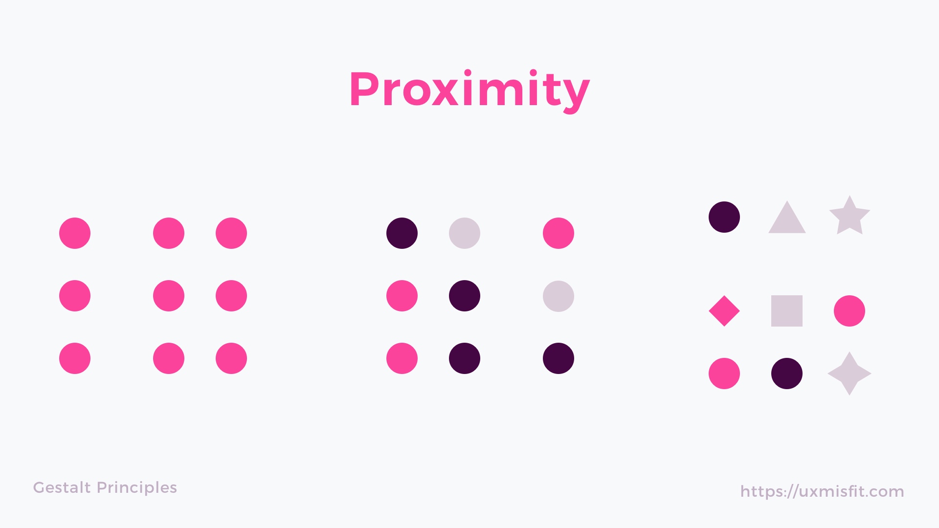 |
| Figure 1.2.4 Principle of Proximity |
- Objects are automatically interpreted as being either in the foreground or the background. They either stand out prominently in the front or recede into the back.
 |
| Figure 1.2.5 Principle of Figure/Ground |
- Elements that are symmetrical with each other will be more likely to be grouped together than elements not symmetrical with each other. Similar to the principle of similarity.
 |
| Figure 1.2.5 Law of Symmetry & Order |
Lecture 2 - Balance and Emphasis
1. Balance
- It means distribution of visual weight in a work of design. The visual equilibrium of the elements causes the full image to show balanced. Balance can be symmetrical or asymmetrical.
 |
| Figure 2.1 Balance |
- Symmetrical balance is about achieving visual equilibrium by evenly distributing elements on either side of a central axis or point. It creates a sense of harmony and stability in design, like a mirror image where each side reflects the other.
 |
| Figure 2.1.1 Symmetrical Balance |
- Asymmetrical balance involves distributing visual elements unevenly across a composition while maintaining a sense of balance through contrast, color, and size. It creates dynamic and visually interesting designs by offsetting elements rather than mirroring them yet achieving equilibrium through careful placement and proportion.
 |
| Figure 2.1.2 Asymmetrical Balance |
--- The Golden Ratio
- The Golden Ratio is a mathematical proportion often found in nature and art, represented by the ratio of approximately 1.618:1. It's characterized by its aesthetic appeal and harmonious balance. In design and aesthetics, it's used to create visually pleasing compositions by dividing elements in a way that follows this ratio.
 | |
|
 |
| Figure 2.1.4 The Golden Ratio Example |
--- Rule of Thirds
- The Rule of Thirds is a composition guideline to create more dynamism to a work of design/photography/film/painting. It involves dividing an image into nine equal parts using two equally spaced horizontal lines and two equally spaced vertical lines, resulting in a grid with nine sections. The rule suggests placing key elements along these lines or at their intersections, rather than in the center, to create a more visually appealing and balanced composition.
 |
| Figure 2.1.5 Rule of Thirds |
2. Emphasis
- It is used to create dominance and focus on design work Use various elements such as color, shape, or value.
 |
| Figure 2.2 Emphasis |
Lecture 3 - Repetition and Movement
1. Repetition
- The repetition of elements of design creates rhythm and pattern within the work and it could make the work of design seem active. Variety is important to keep rhythms exciting and active, and to avoid monotony. Pattern though visual excitement by enriching surface interest.
 |
| Figure 3.1 Repetition |
2. Movement
- Movement in a visual image happen when objects seem to be moving in a visual image. The movement comes from the kinds of shapes, forms, lines, and curves that are used.
 |
| Figure 3.2 Movement |
3. Hierarchy
- Hierarchy is the choreography of content in a composition to convey meaning and information. Visual hierarchy guides viewers to the most important information first and identifies navigation through secondary content.
 |
| Figure 3.3 Hierarchy |
4. Alignment
- Alignment in design is the strategic arrangement of elements to create unity and cohesion, achieved by lining up edges or centers. It enhances aesthetic appeal and stability while guiding viewers through the composition.
 |
| Figure 3.4 Alignment |
Lecture 4 - Harmony and Unity
1. Harmony
- Harmony involves the selection of elements that share a common trait. Without variety, harmony becomes monotony. Harmony is the sense that every elements of design fit together. They may fit the same theme, aesthetic style or mood.
 |
| Figure 4.1 Harmony |
2. Unity
- Unity happens when elements are composed in a balance way to create a theme and pull the look together. It refers the repetition of particular elements throughout your design.
 |
| Figure 4.2 Unity |
3. Scale
- Scale means the size and dimension of an object relative to a specific unit of measure.
- Scale can be determined in two ways:
1. Actual Measurement
2.Visual estimation based on comparison
 |
| Figure 4.3 Scale |
4. Proportion
- Proportion is comparing size, color, quantity, degree, setting. Design with proportion results in harmony and unity.
 |
| Figure 4.4 Proportion |
Lecture 5 - Symbol, Word & Image
1. Symbol
- Sign, shape, or object that is used to represent something else. In terms of design, a symbol can represent a single word, several sentences, or even a whole narrative.
 |
| Figure 5.1 Symbol |
- Image-related and simplified pictures.
 |
Figure 5.1.1 Pictorial Symbols |
--- Abstract Symbols
- It is possible to look like the objects they represent, but with less detail.
 |
| Figure 5.1.2 Abstract Symbols |
--- Arbitrary Symbols
- It bears no relation to the items or concepts stand for. It is created with the meaning constructed. Many are based on geometric shapes and colors.
 |
| Figure 5.1.3 Arbitrary Symbols |
2. Word and Image
- Typography is the design and arrangement of text to express message. Use a suitable typeface and imagery will result in visual hierarchy and balance in a work of design.
 |
| Figure 5.2 Word and Image |
UNSDG GOAL
We are required to pick and briefly describe ONE goal from the United Nations' Sustainable Development Goals (UNSDG).
There are a total of 17 goals, which are:
- No Poverty
- Zero Hunger
- Good Health and Well-Being
- Quality Education
- Gender Equality
- Clean Water and Sanitation
- Affordable and Clean Energy
- Decent Work and Economic Growth
- Industry, Innovation and Infrastructure
- Reduced Inequalities
- Sustainable Cities and Communities
- Responsible Consumption and Production
- Climate Action
- Life Below Water
- Life on Land
- Peace, Justice and Strong Institutions
- Partnerships for the Goals
The goal that I selected is the sixteenth goal - Peace, Justice and Strong Institutions.
This goal aims to promote peaceful and inclusive societies for sustainable development, provide access to justice for all and build effective, accountable and inclusive institutions at all levels.
SELECTED DESIGN
 |
| Victory is near is a mixed media by Yuliia Kiselova, June 10th, 2022, Canvas 60x60, Acrylic, Texture Paste. |
This is a heart-wrenching reality. While we may enjoy peace and tranquility, many people around the world still live under the shadow of war, conflict, or violence. For them, every day is a challenge filled with fear and uncertainty. In this artwork, it was a white dove flying with an olive branch in its mouth, and both of these elements are considered symbols of peace in Christianity. The reason I chose this artwork is because it aligns with the sixteenth goal in UNSDG, "Peace, Justice, and Strong Institutions.".
I am grateful to have been born in a peaceful country and to enjoy life in an era of peace. While I feel sorrow for the innocent civilians living in war-torn countries, I am powerless to help. All I can do is pray for these unfortunate people, praying for the wars to end soon so that innocent individuals can once again look up at the sun rising and the stars shining in the night sky without worry.
Design Principles: Balance, Movement, Repetition, Emphasis
FEEDBACK
General Feedback: Add photo for the lectures and put a caption for each photo.
Specific Feedback: Ms. Jinchi asked me how the artwork I chose aligns to the goal I chose. After giving my opinion, Ms. Jinchi suggested me to add the reason (dove) I chose this artwork to enhance my interpretation of this artwork.
REFERENCE
- Victory is near - Yuliia Kiselova

Comments
Post a Comment