Advanced Typography / Task 2
22.05.2024 - 21.06.2024 (Week 5 - Week 9)
Tan Sin Mi (0368821)
Advanced Typography
Task 2
CONTENT
INSTRUCTIONS
LECTURES
Week 5: Lecture 5- Perception & Organization
Perception
1. Definition
- Perception is how something is regarded, understood, or interpreted. In typography, it involves visual navigation and interpretation via contrast, form, and organization of content.
- Typography deals with how textual, visual, graphical, and color elements are perceived and understood.
Contrast
1. Size
- Large elements draw attention first, such as a big letter standing out against smaller letters. Commonly used to make titles or headings more prominent than body text.
2. Weight
- Bold type can stand out amidst lighter type of the same style. Other methods include using rules, spots, and squares to create heavy areas for visual emphasis.
3. Form
- Distinction between different letter forms like capitals and lowercase, roman and italic, condensed and expanded versions of a typeface.
4. Structure
- Different letterforms of various typefaces, such as monoline sans serif versus traditional serif, or italic versus blackletter.
5. Texture
- Combination of size, weight, form, and structure applied to a block of text. Texture refers to the overall look of lines of type both up close and from a distance.
6. Direction
- Opposition between vertical and horizontal, and angles in between. For example, turning a word on its side or mixing wide blocks with tall columns.
7. Color
- Use of color to create emphasis. Consider tonal values to ensure important elements stand out appropriately.
Form
1. Definition
- Form in typography refers to the overall look and feel of the typographic elements, playing a crucial role in visual impact and first impressions.
2. Functions
- Typography serves to represent concepts visually, providing unique characteristics and abstract presentations of letterforms.
3. Interplay
- Balancing meaning and form to create harmony in function and expression. Manipulated forms through distortion, texture, enlargement, etc., can transform letters into shapes that are no longer readable as letters.
Organization / Gestalt
1. Definition
- Gestalt is the German word for the way something is "placed" or "put together." Gestalt psychology aims to understand the laws of meaningful perception.
2. Principles
- Gestalt principles predict perceptual grouping, emphasizing that the whole is greater than the sum of its parts. Design components are evaluated based on overall visual form rather than individual elements.
Perceptual Organization / Groupings
1. Law of Similarity
- Similar elements (color, orientation, size, motion) are perceived as a unified group.
2. Law of Proximity
- Elements close together are seen as a unified group.
3. Law of Closure
- The mind completes incomplete figures or forms, filling in gaps.
4. Law of Continuation
- Humans perceive intersecting objects as distinct, uninterrupted objects, influenced by their alignment.
5. Law of Symmetry
- Symmetrical elements are perceived as unified groups.
6. Law of Simplicity (Prägnanz)
- Elements are perceived in the simplest form possible.
TASK 2A - KEY ARTWORK
In this task, we are required to use our name (first name/pet
name/pseudonym) with a minimum of at least 4-5 characters to produce
explorations of possible wordmark/lettering. Showcase sketches leading to
a digitized artwork.
Image Searching:
First, I browsed Pinterest and searched some artwork as my visual
references before I start to do my sketches.

|
| Figure 2.1 Visual Reference |
Sketches:
Then, I used Procreate to sketch out some of my idea.

|
| Figure 3.1 Sketch 1 |

|
| Figure 3.2 Sketch 2 |

|
| Figure 3.3 Sketch 3 |

|
| Figure 3.4 Sketch 4 |

|
| Figure 3.5 Sketch 5 |
Digitalization:
After much consideration, I decided to continue with the Sketch 4 as my
final wordmark. The reason I chose Sketch 4 is because it represented more
closer to my three keywords for my wordmark which is
Symmetry, Simplicity and Clarity. Compared with complicated
designs, I prefer more simple and clear design. After digitizing my chosen
sketch, I could refine some of the intricate details to ensure my design
achieves the desired design.
Figure 4.1 Process of Digitalization
We are required to print our wordmark on paper to see how it looks.

|
|
Figure 4.2 Print out wordmark on paper |
After that, we have to choose color palette and use the color palette on
our wordmark. I decided to use the last color palette to work on my other tasks.
Figure 4.3 Process of color palette
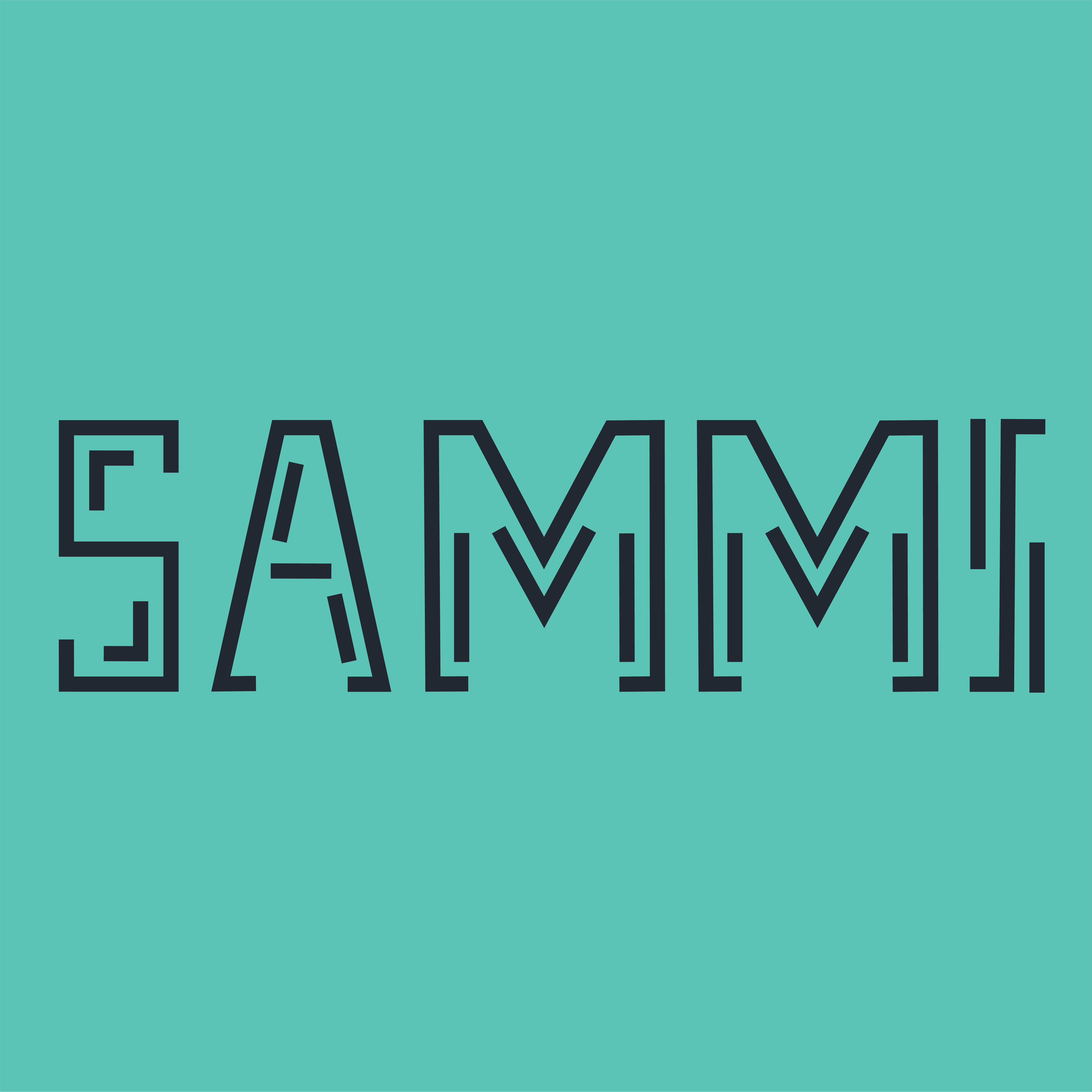
Final Key Artwork:

|
|
Figure 5.1 Black word on white background |

|
|
Figure 5.2 White word on black background |

|
| Figure 5.3 Color palette |
|
| Figure 5.4 Darkest color wordmark on lightest shade |

|
| Figure 5.5 Lightest color wordmark on darkest shade |
TASK 2B - COLLATERAL
In this task, we are required to apply our key artwork on 3 collaterals
and use mock-ups to simulate the printing of the collaterals. Besides,
an animated Key Artwork are also requested. Lastly, we are also required
to include an Instagram link and a high-resolution screen grab of the
Instagram profile.
Some logo design based on wordmark:
Before I work on my animation, I have designed a logo for my
wordmark. The logo I designed are inspired by the maze floor plan.

|
|
Figure 6.1 Final Outcome |
|
Figure 6.2 Final Outcome |

|
|
|

|
|
|

|
|
|

|
|
|
|
Figure 6.7 Final Outcome |
Animation:
Open a new Illustrator file, edit every scene of the animation first.
After done editing, export all of artboards. Then, use Adobe Photoshop to
edit the animation.
Figure 7.1 Process of animation
Final Animation:

|
|
|
Collateral:
Lecturer has provided a link for us to work on our mockups.
Click here for the link:
Mockey.
After having a look on Mockey, I have chosen Hoodie, Phone Cover and Beanie as
my collaterals. I uploaded my wordmark to each template and adjust the size
and position to make it more natural and balanced. After saving the images, I
used Adobe Photoshop to edit some details.
| Figure 8.1 Wordmark Animation |
Figure 8.2 Wordmark Animation
Figure 8.3 Wordmark Animation
.png)
|
| Figure 8.4 Process |
Final Collateral:
.jpg)
|
|
Figure 8.5 Wordmark Animation |
.jpg)
|
|
Figure 8.6 Wordmark Animation |
.jpg)
|
|
Figure 8.7 Wordmark Animation |
Instagram Link: 𝙨𝙖𝙢𝙢𝙞_𝙙𝙚𝙘𝙤
 | |
|
| Figure 8.8 Wordmark Animation |
FEEDBACK
Week 6:
Absent.
Week 7:
Get some visual reference from Pinterest fist before I started to design
my key artwork. Upload eportfolio.
Print out the fonts in 175x175mm and 15x15mm square box. Ensure the
artwork are clear and visible even at small sizes.
Week 8:
Independent Learning Week.
REFLECTION
Experience:
This task was a creative challenge and made me grow a lot on designing and typography. I experimented with various wordmark designs for my name, "Sammi", then extending the final wordmark design across different item, such as hoodie, phone cover, beanie, animation and some logo design, it required meticulous adaptation to ensure visual consistency and impact across each format. And also, not only on items, a good post layout is also important on social platforms. So, I learned quite lot new things in this task and I was enjoy with it.
Observation:
Through this task, I learned that typography is an indispensable art in today's society. No matter what product, online platform or the big or small objects you can see in daily life, they are more or less related to typography. A perfect key artwork must perfectly integrate design and typography, so when designing, we should pay attention to various details and optimisation to improve the overall effect of the design.
Findings:
This experience deepened my knowledge of the nuances of designing for various presentation. It was both challenging and rewarding, offering valuable insights into visual communication and a deeper understanding on typographic systems and design principles.
FURTHER READING
 |
| Figure 9.1 "The Vignelli Canon" by Massimo Vignelli |
PART 1: THE INTANGIBLES
Appropriateness
Massimo Vignelli stresses the importance of choosing the right design elements, such as colors, fonts, and layouts, based on the specific requirements of the project.
- Appropriateness is the search for the specific of any given problem.
- To define that prevents us from taking wrong directions, or alternative routes that lead to nowhere or even worse, to wrong solutions.
- Directs us to the right kind of media, the right kind of materials, the right kind of scale, the right kind of expression, color and texture.
- Elicits the enthusiastic approval of the client seeing the solution to his problem.
Ambiguity
Massimo Vignelli suggests that clarity in design is essential and that ambiguity should be avoided, as it can lead to confusion or misinterpretation.
- Intended as a plurality of meanings, or the ability of conferring to an object or a design, the possibility of being read in different ways.
- One has to be cautious in playing with ambiguity because if not well measured it can backfire with unpleasant results.
- Contradiction can sometimes reinforce ambiguity, but more often it is a sign of discontinuity and lack of control.
- Ambiguity and contradiction can enrich a project but can equally sink the end results.
Design Is One
Massimo Vignelli emphasizes the unity and coherence in design with the phrase "Design Is One." This concept underscores the idea that design, regardless of its specific form or medium, is a singular and integrated discipline.
- Master a design discipline to be able to design anything, because that is what is essential and needed on every project.
- The discipline of Design is one and can be applied to many different subjects, regardless of style.
- Design discipline is above and beyond any style. All style requires discipline in order to be expressed.
Visual Power
Massimo Vignelli's message is that powerful visual communication relies on a careful balance of elements that captivate and resonate with the audience.
- Visual strength can be achieved also by using delicate layouts or materials.
- Visual strength is an expression of intellectual elegance and should never be confused with just visual impact - which, most of the time, is just an expression of visual vulgarity and obtrusiveness.
- Visual power is a subject which deserves great attention to achieve effective design.

Comments
Post a Comment